• work

wrangell convention & visitors bureau

insight

visitors welcome. tourists, not so much.

objective  |  create a destination brand for a proud, friendly community of Alaskans that want to share their home with intentional visitors looking for high-quality, active, and immersive Alaskan experiences.

industry
tourism

collateral
identity
brand guidelines

modes activated
exploration

overview

branding a community

The brand needed to represent the incredible landscape of Wrangell‘s backyard, the quirky – but proud – friendly people of Wrangell, and attract a visitor interested in the community. For a city located along the southeast coast of Alaska and counting on the cruise industry to provide at least part of their economy, attracting an authentic, interested visitor was still more important than filling the swag shops on the dock.


brand promise

up-close exploration of an unspoiled, somewhat mysterious, insider’s Alaska

new logo

The brand logo was created to boldly represent the spirit of Wrangell. It’s bold, confident, and authentic as well as a little quirky and rough around the edges.

The tagline lives scrawled above the wordmark as a further reminder of Wrangell’s honest and nonconforming attitude.

brand colors

The brand colors were chosen to best represent the place of Wrangell. It’s an earth-tone inspired, yet vibrant palette, that should be used to complement photography and add excitement to the brand look.

icons

The brand icons were inspired by and loosely reference the petroglyphs found throughout Wrangell.

website redesign

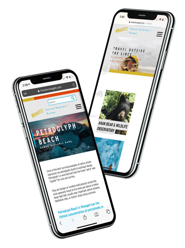
We also helped them update their current website with the new brand look and feel, and a new, user friendly CMS.

deliverables

brand research, brand identity, logo design, tagline development, custom iconography creation, brand guidelines, sample ad placements and web design elements