
“What if…” is a question that marketers constantly ask.
“What if we run a new marketing campaign?”
“What if we introduce a new price?”
“What if we move into a new market?”
These types of questions lead to actions. And those actions lead to more questions:
“We ran a new marketing campaign. What was the impact of that campaign? Did it make a difference?”
Measuring ROI
There are a few ways to approach these questions. The first is to simply compare key metrics, say website traffic, before and after the campaign. It’s quick and easy, but it doesn’t take factors outside the campaign into account, which can skew your results.
Another measurement tactic is A/B testing — divide your target audience and compare measures between two groups. These tests can be difficult and expensive, and their answers aren’t absolute either.
What we’d really like is the luxury of knowing what a world without our campaign would look like.
Measurement Inspired by the Movies
There is a way to guess what that alternative present might be…
Let’s use the example of George Bailey’s life in the classic It’s a Wonderful Life.
Most of the movie is about George Bailey’s effect on the Bedford Falls community. Near the end of the story, when George is at the end of his rope, he wishes he’d never been born. Clarence, an angel, shows George what would’ve happened to Bedford Falls without George. Spoiler: It’s much worse. George, seeing the error of his ways, prays for his old life back and realizes that he, despite the problems he faces, truly has a wonderful life.
“Clarence Testing” at Work
Here’s how we apply our own Clarence (really a methodology of inferring causal impact using Bayesian structural time-series modeling*) to determine the impact of marketing efforts on KPI.
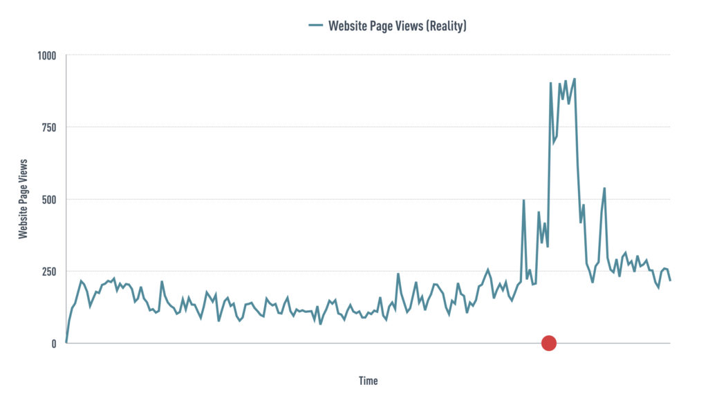
This graph shows website traffic for one of our clients over the course of a year. The red dot indicates when we launched a marketing campaign. The blue line is what happened to web traffic; notice the spike.
We want to know the impact of the marketing campaign, so we tell our “Clarence” to predict what would have happened had we NOT launched it, which is indicated by the dotted orange line.
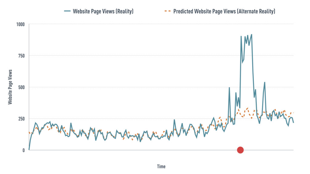
The difference between this dotted orange line, the synthetic prediction, and the solid blue line—what actually happened to website visits—shows the impact of our marketing efforts.
What This Means for Marketers
Quantifying the impact of marketing efforts is always top-of-mind. With tightening marketing budgets, every dollar needs to show a return on investment. Powerful data analysis tools can help quantify impact and prove ROI for your efforts.
Give us a call at Spawn Ideas to learn more. After all, every time our phone rings, a client gets an answer.
*a machine learning technique used for inferring causal impact